
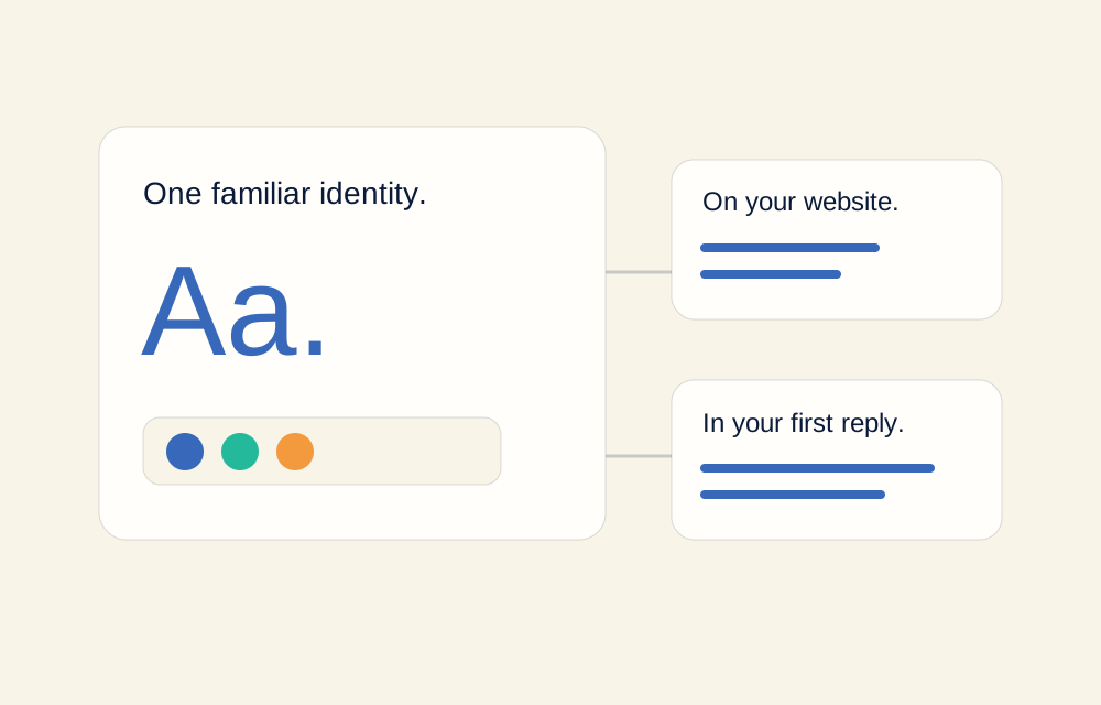
Keep what customers already recognise
A redesign does not have to start by replacing your identity. Your existing logo, colours, illustrations, and familiar tone can be the strongest starting point. First decide what still represents the business and what is making the current presentation harder to understand.
Keep a short reference of approved assets and how they should be used. The aim is not to make every page identical. It is to make the business recognisable while giving each page room to do its particular job.
Use colour roles, not a new palette per section
Choose a dominant background, a readable text colour, and one clear action colour. Then decide where secondary accents are useful. This creates hierarchy without asking every section to introduce another shade or atmosphere.
For Botify, sand is the main surface, warm ivory is the card surface, and the original blue identifies actions and selected states. Navy is mainly for text; teal and orange are smaller identity accents. The illustrations can keep their original character without turning every background into a competing colour block.
- Use the same action colour for the same kind of action.
- Keep body text readable against the surrounding surface.
- Reserve accents for details that deserve attention.
- Check the page as a whole, not only one section at a time.
Make the words feel connected too
A visual identity can be consistent while the wording is not. If one page says “get started,” another says “buy now,” and the next offers a consultation, the visitor has to work out which promise to trust. Choose labels that describe the actual service journey.
Keep service names, inclusions, and next steps aligned across the homepage, pricing page, articles, and customer replies. An AI receptionist should use the same approved business information, not invent a different version of the offer.
Let different pages have different jobs
A service page should help someone understand the work. A pricing page should explain the costs and scope. An article should offer a useful reading experience. They can share colours and navigation without sharing the same oversized headline, cards, and sales section.
Consistency is the shared foundation. Repetition is making every page do the same thing.
A useful distinction when reviewing a redesign
Vary the content structure with purpose: a checklist for preparation, a diagram for a process, and a focused reading column for an article. Keep the identity stable while the presentation follows the information.
Review the small moments, not just the homepage
Read the navigation, button labels, form errors, confirmation messages, and booking instructions together. These small moments often reveal inconsistencies that a polished hero image hides. Check mobile layouts and keyboard focus as well as the main desktop view.
Ask whether someone would recognise the same business at each step. If the answer is no, simplify the colour choices, align the wording, or remove a decorative treatment that is competing with the purpose of the page.
Botify’s website design service starts with the brand you already have. We discuss the pages, visual direction, and practical next steps together, rather than replacing your identity with a generic template.